A Victorian house in London with a cheerful “color-blocking” decor
Suivez Planète Déco sur Google — ajoutez-nous à vos favoris pour retrouver nos articles déco dans votre fil d'actualitésYellow, powder pink, mint green: a tour of a renovated Victorian house in London where color blocking replaces walls
Behind its classic facade, this Victorian house in London hides a unique and colorful interior. The architecture studio Russian for Fish renovated the duplex apartment located on the first and second (and top) floors. Stepping into this apartment is like stepping into a box of colored pencils. Yellow, sky blue, powder pink, and mint green adorn the rooms. Each room has its own color palette, yet the space exudes a true sense of harmony. The 19th-century moldings of this historic home complement the modernity of the renovation.
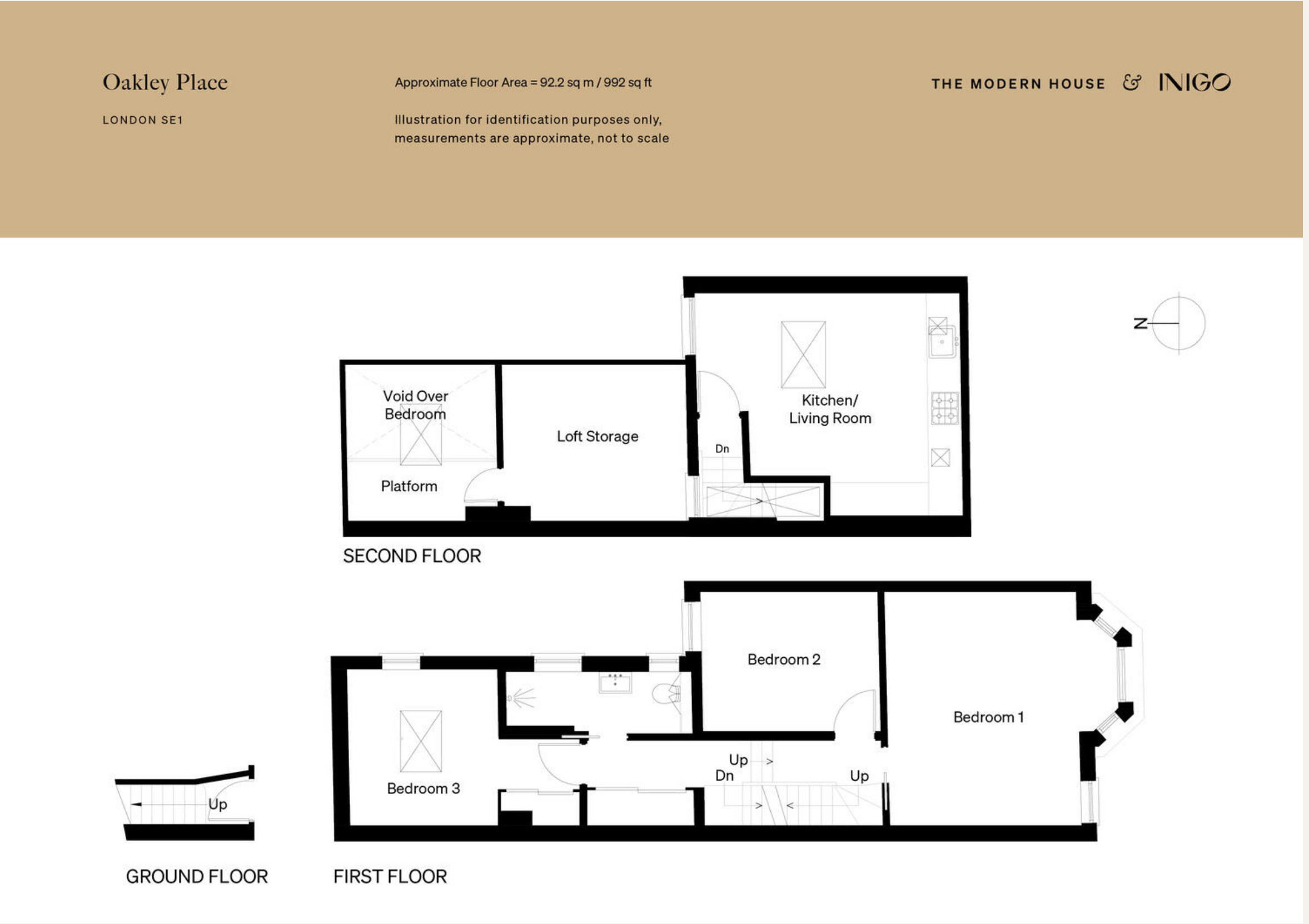
With a total area of 92 square meters, the apartment features an inverted floor plan. The three bedrooms are on the first floor, while the living area occupies the top floor and benefits from overhead natural light. From the kitchen, the view stretches all the way to the skyscrapers of the City.


A typical London Victorian brick house
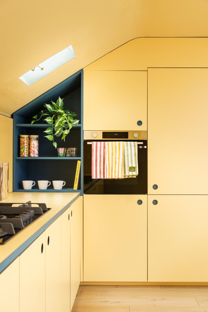
The apartment is located on a quiet, tree-lined street in the heart of a conservation area. The townhouse that houses it features a typical London yellow brick facade, the famous London stock brick. Bands of white stucco highlight the window arches.
The large bay windows, those quintessentially British features, capture the light from the street. From the sidewalk, there’s no hint of the explosion of colors that awaits inside. This contrast between a subdued facade and a bold interior is what gives the place its charm..

A blue entryway and a lemon-yellow staircase
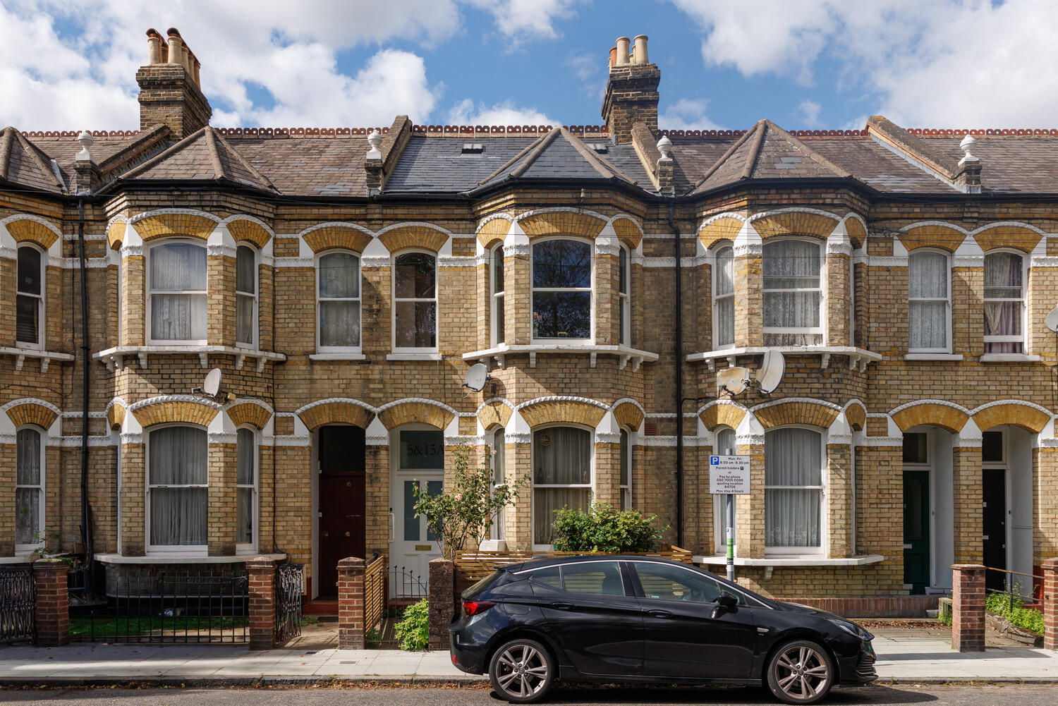
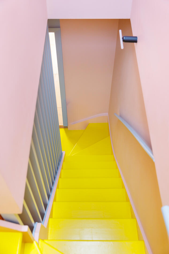
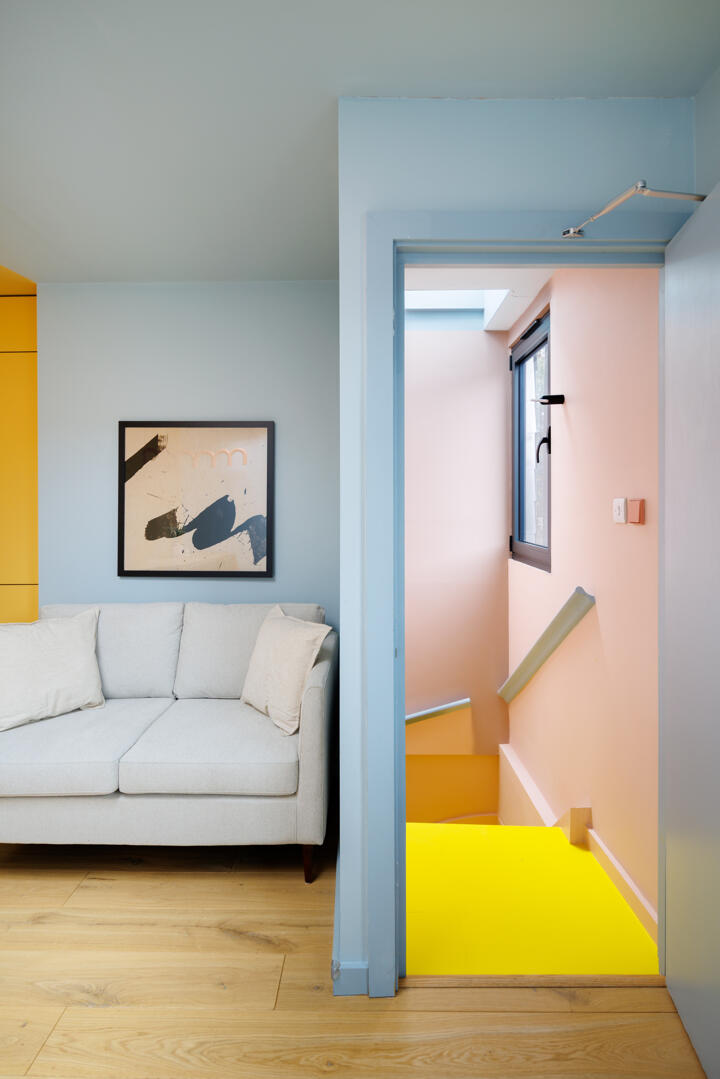
The tour begins right at the front door. The deep blue entryway leads to the first floor. From this level, reserved for the bedrooms, a second flight of stairs climbs to the top of the house. Lemon yellow paired with pink was chosen for this staircase. The architects treated this passageway as a room in its own right.


A yellow kitchen under the eaves
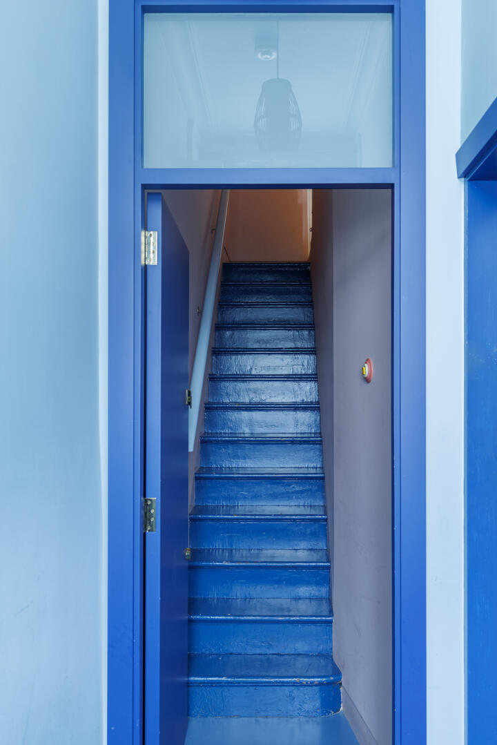
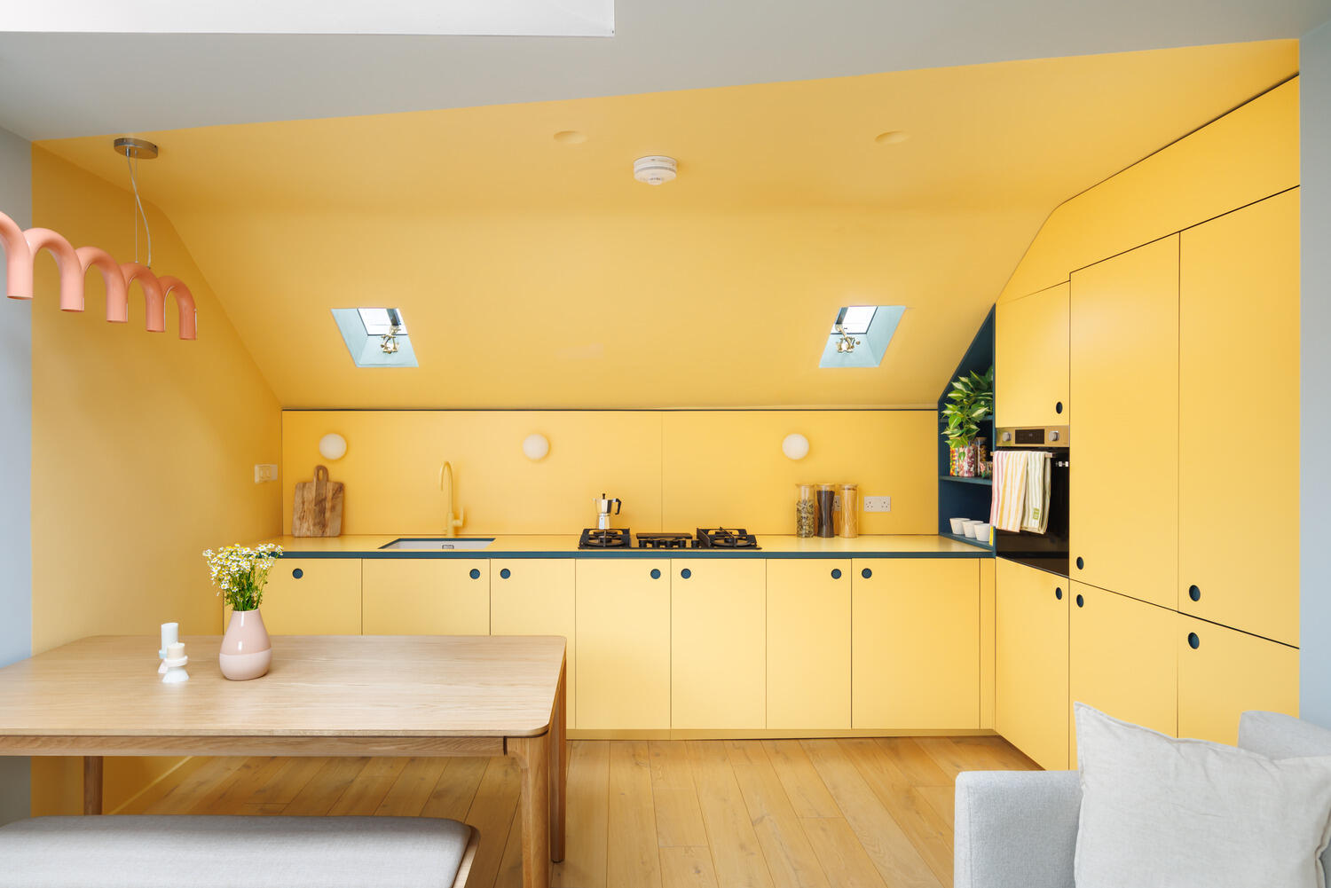
The kitchen is anything but ordinary. Its yellow Formica cabinet fronts are complemented by a Valchromat countertop. This through-dyed material reveals a thin blue trim along the edges of the cabinet doors and countertop. The handles are simple round holes drilled into the surfaces, which also reveal this blue. The faucet is exactly the same yellow as the cabinets. Its walls, sloped ceiling, and backsplash all share this sunny shade. An open blue niche provides a place to set out dishes.

Color blocking to define zones
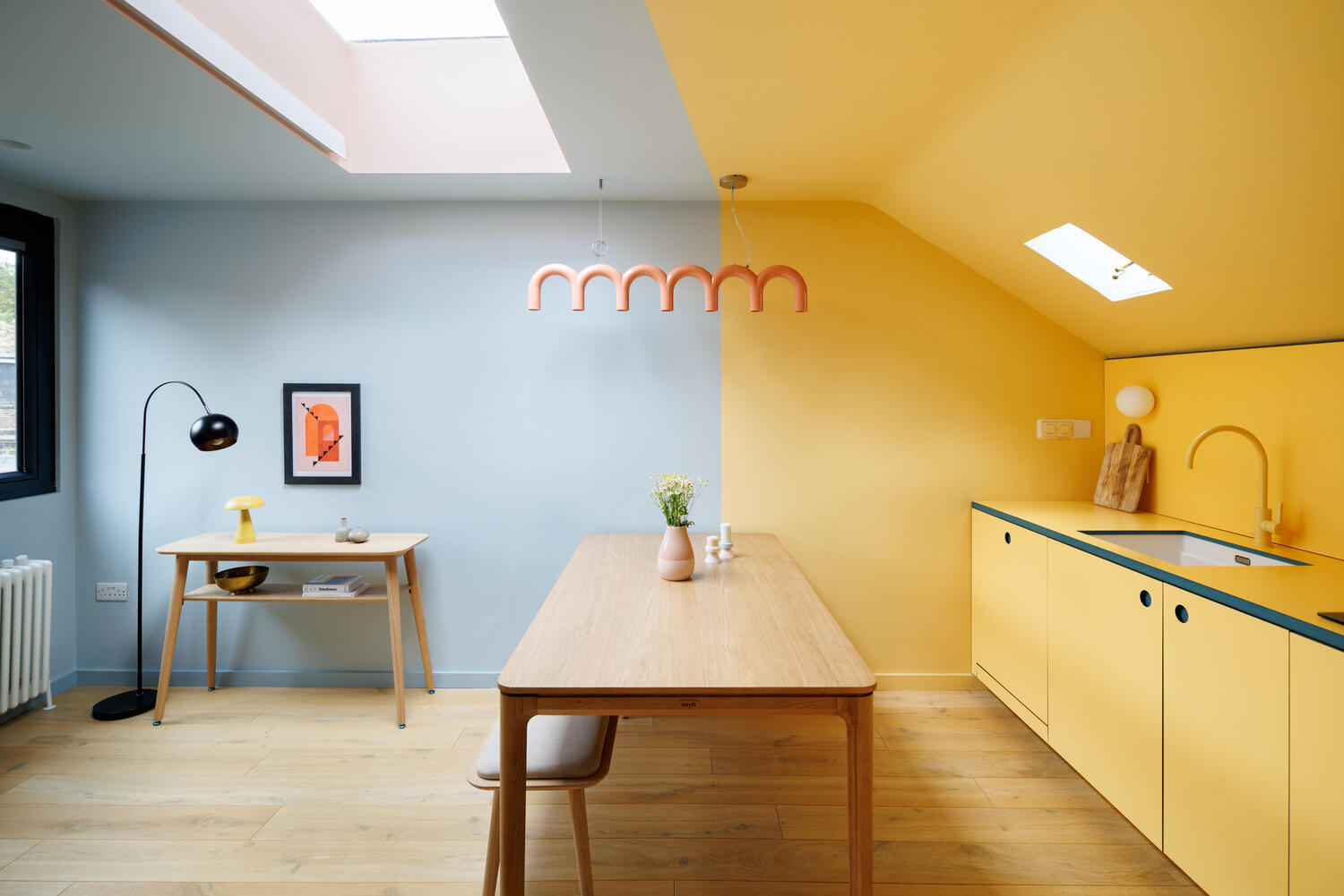
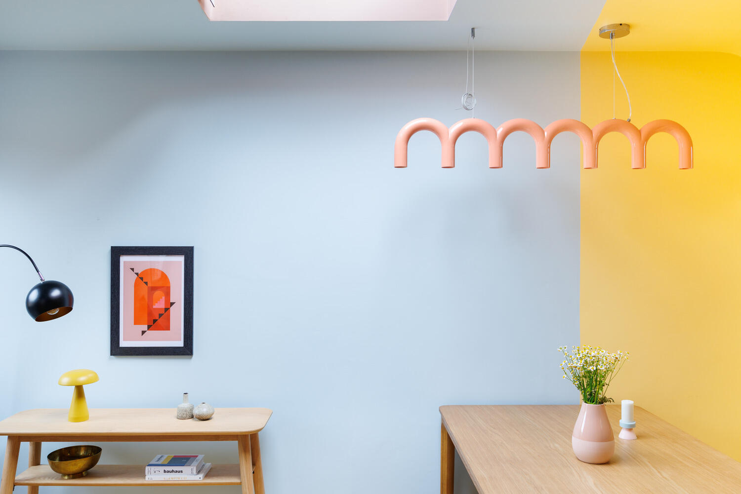
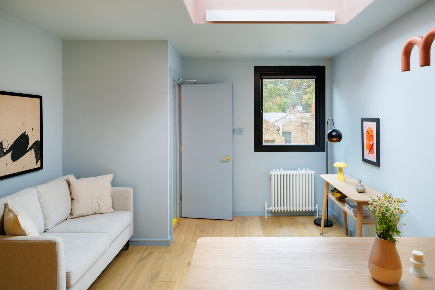
In this living area, color replaces partitions. Yellow defines the kitchen area, while a very soft sky blue covers the walls of the dining area and the small living area. The boundary between the two shades precisely follows the angle of the wall and the slope of the roof. Above the oak table, the pink “Arch” pendant light by Oblure illuminates the dining area. The yellow from the kitchen is echoed by the mushroom-shaped lamp sitting on the wooden console table. Skylights flood the space with natural light. A window at the back overlooks the cityscape and the City.



A mint-green office bathed in light
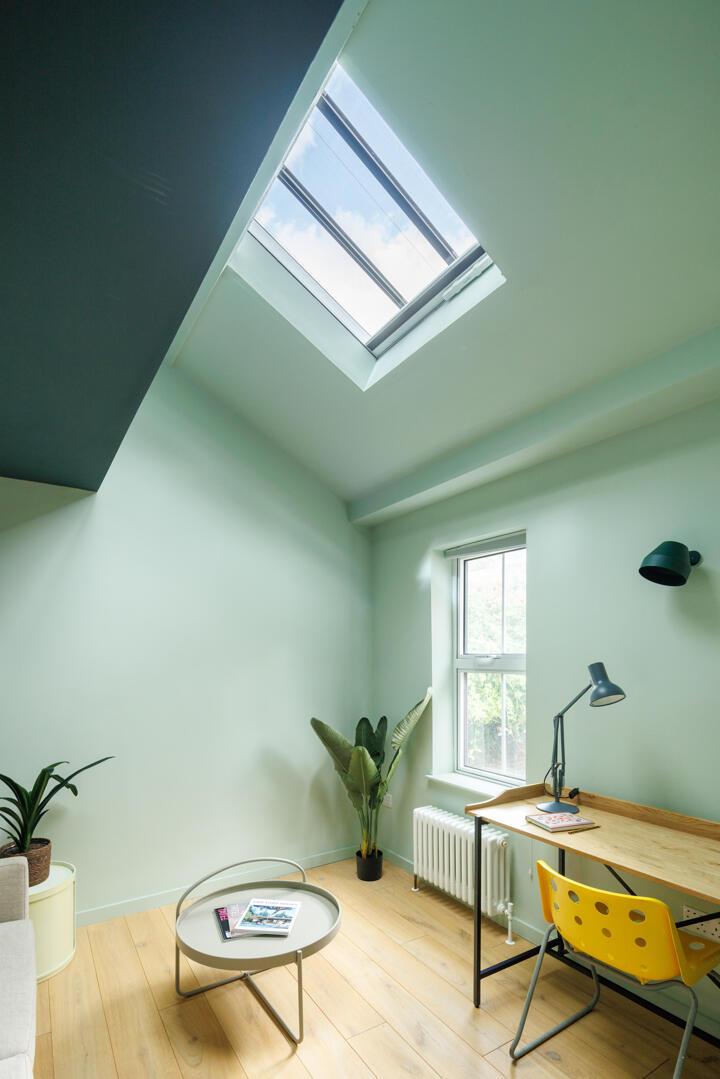
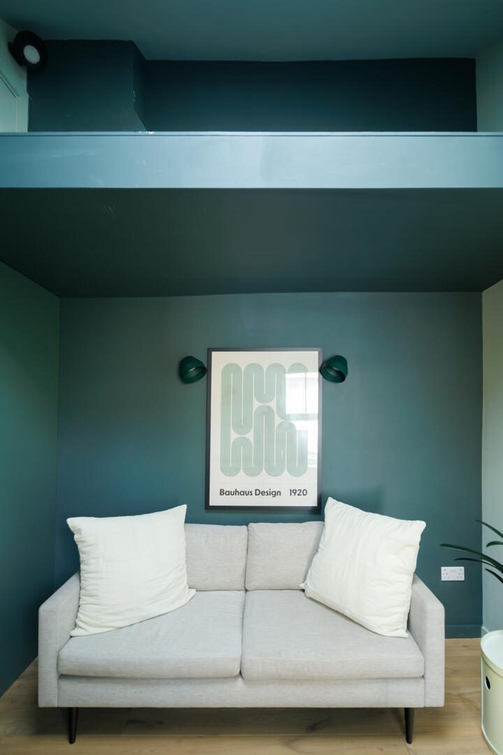
Next to the living area, an office painted mint green is the ideal spot for working from home. This color is known to promote concentration and reduce stress. A large skylight brings the sky into the room. A yellow perforated chair echoes the neighboring kitchen and connects the two spaces. Above, a mezzanine serves as storage. In the small adjacent sitting room, everything is painted teal, walls and ceiling included. Two designer wall sconces illuminate this cozy corner.


A powder-pink and mint-green master bedroom
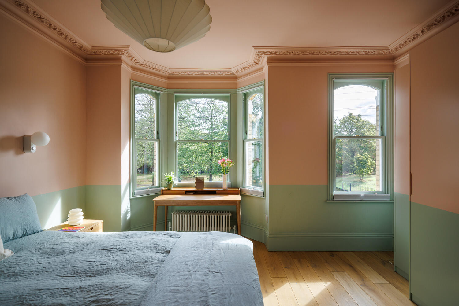
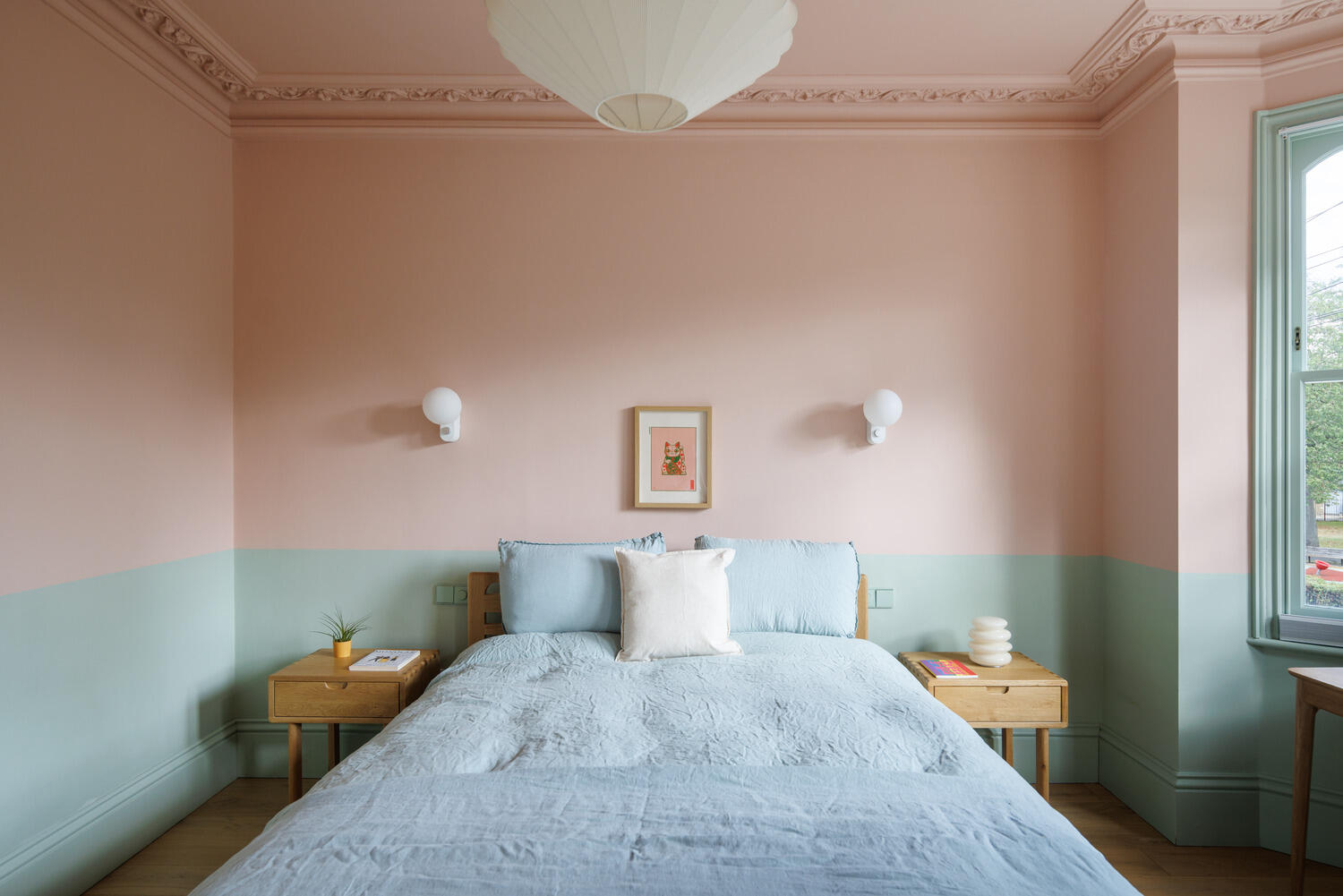
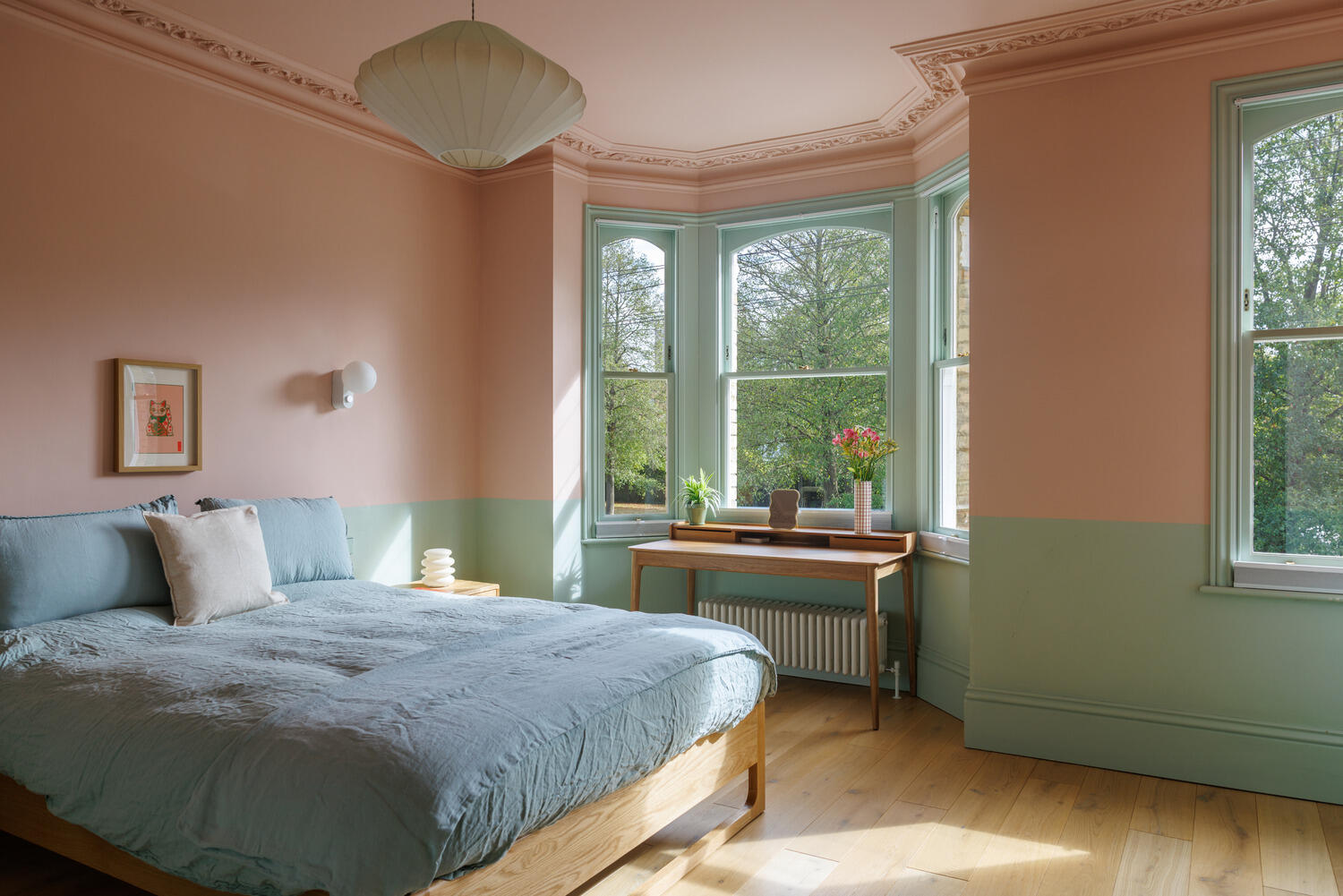
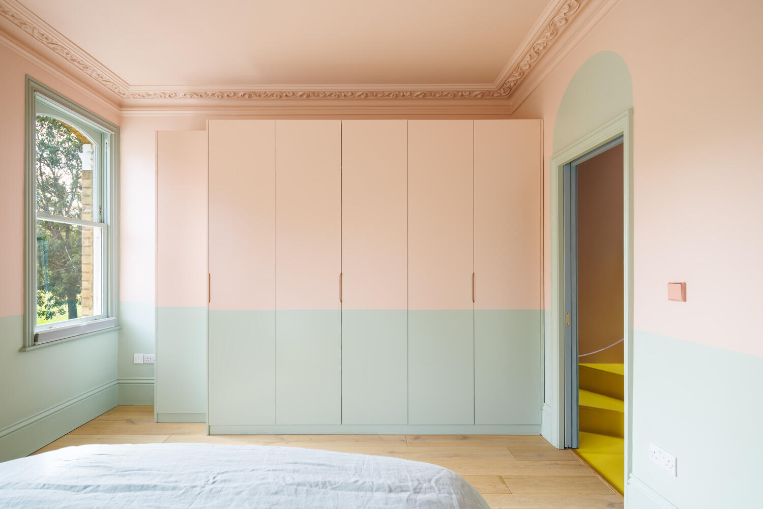
Three bedrooms are located on the lower floor. The master bedroom occupies the front of the house. Its large, typically English window overlooks the trees on the street. The architects preserved its 19th-century rose window and ornate cornices, then painted them powder pink. The same shade of pink covers the upper part of the walls and the ceiling. A mint green base trim adorns the lower section and the window frames. A wall of custom-built closets mirrors this horizontal division exactly. The door is set within a green-painted arch, offering a glimpse of the yellow staircase.




Two other bedrooms with distinct color palettes
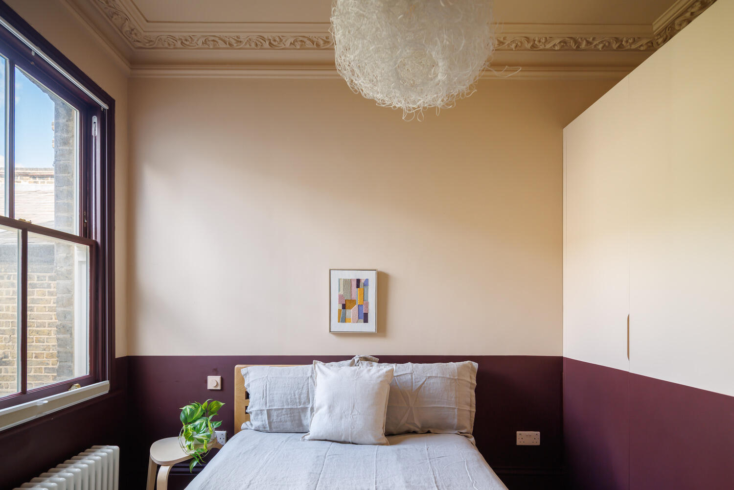
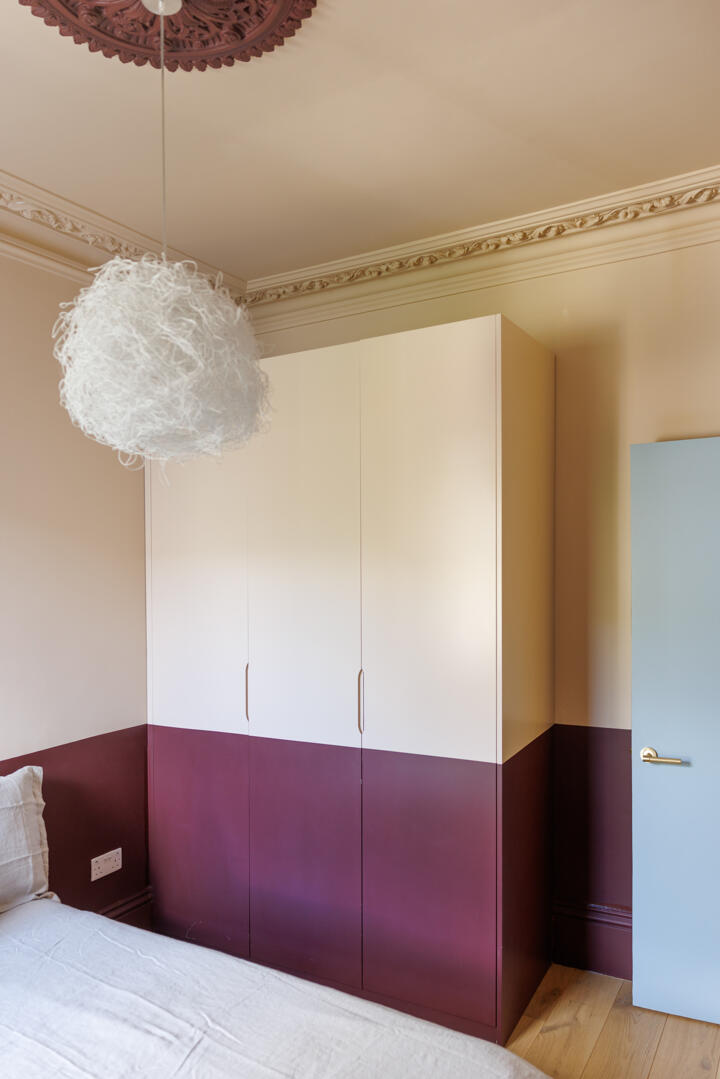
The other two bedrooms have also retained their period features. Each is decorated in its own unique color palette. In one of them, a deep burgundy base contrasts with a pinkish-beige upper wall section. The sash window is painted the same burgundy shade, extending the color scheme.


A soothing white bathroom
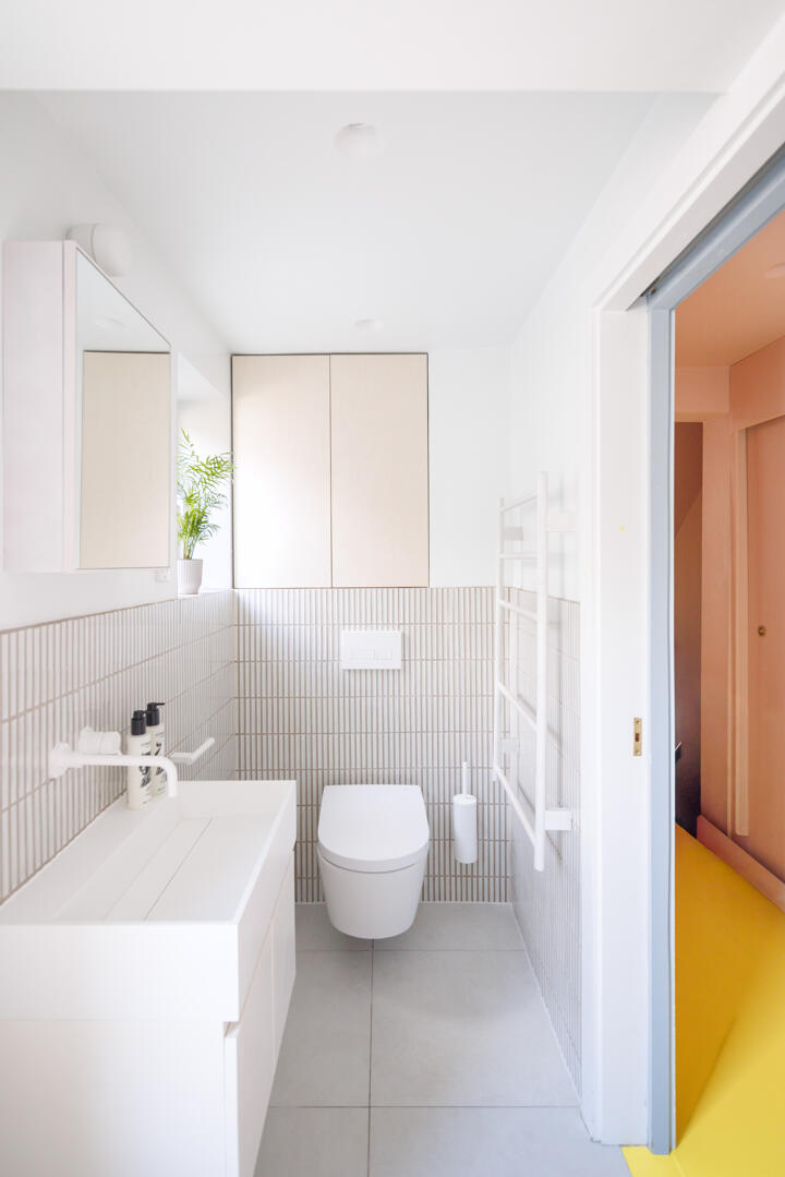
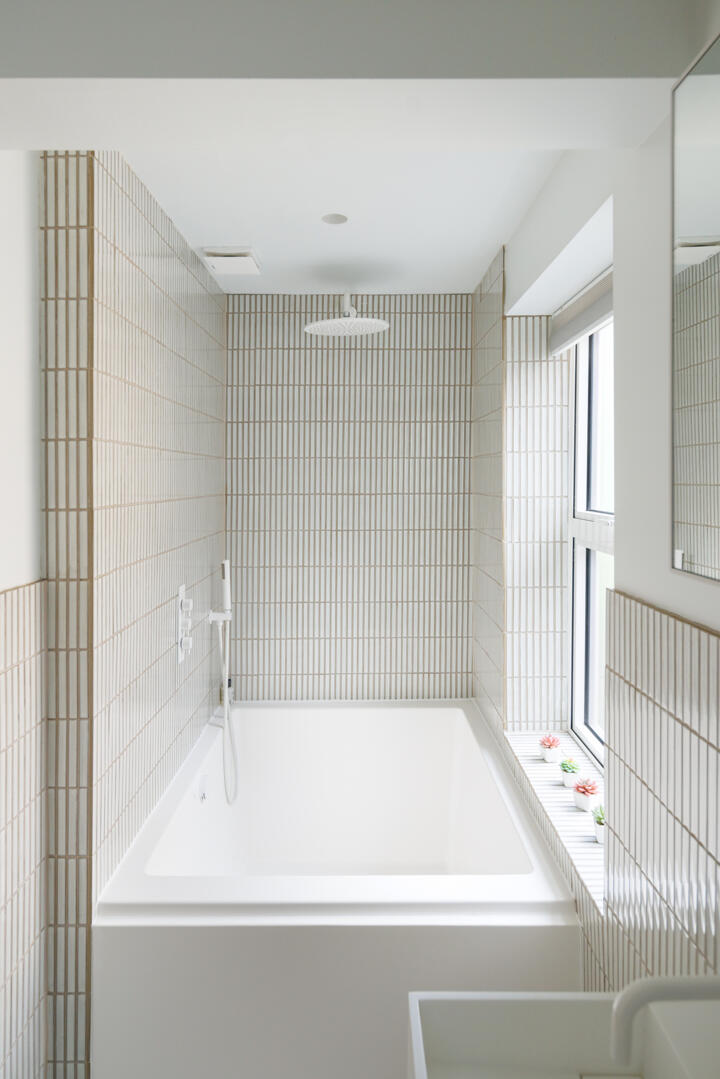
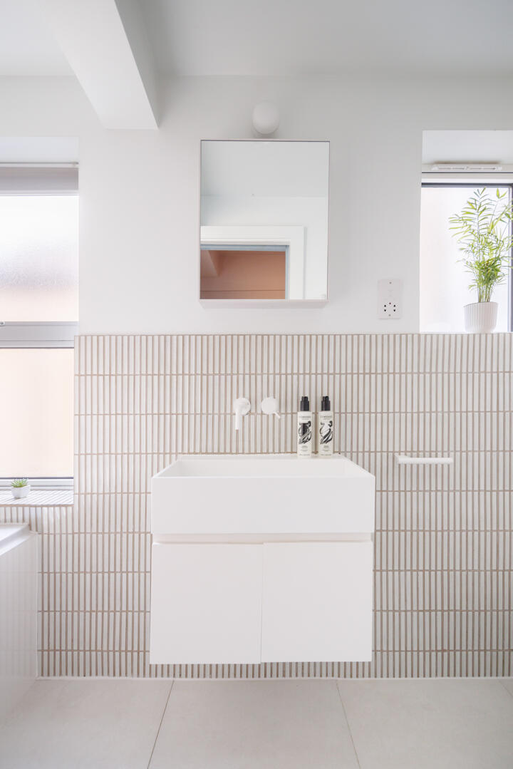
The atmosphere shifts in the bathroom, which is entirely white. It serves as a simple, restful respite within this colorful apartment. A deep Omnitub bathtub is set into a niche lined with Japanese tiles. These narrow vertical tiles are laid with light beige grout.



Our take on the design
Color blocking as an architectural tool
We love this project for its originality, and the color blocking here is taken to the extreme. Russian for Fish doesn’t use color as a mere finishing touch. The studio uses it to organize the space, emphasize volumes, and guide the eye. In the living area, the line between yellow and sky blue is enough to separate the kitchen from the dining area.
No partitions block the light from the skylights. The yellow ceiling, which follows the slope, even transforms a loft constraint into a graphic asset. Although they contrast, the hues share the same softness and ultimately blend seamlessly.
Details that make all the difference
We also love the harmony of the details. The yellow faucet, the round holes in the handles, and the blue trim on the Valchromat are signs of decorative thought taken to the extreme. This repetition of colors from one room to the next creates a unifying thread.
The yellow chair in the office echoes the kitchen. The yellow staircase appears in the frame of the pink bedroom. Finally, the white bathroom serves as a calming element. This alternation between rooms with saturated colors and this neutral space prevents the original decor from becoming tiresome.
A successful blend of old and new
The design of the bedrooms also deserves praise. Painting Victorian moldings in powder pink might have seemed daring. On the contrary, the result highlights these decorative elements, which take on greater depth thanks to the color.
The mint green baseboards, extending all the way to the closets, make the storage units appear less bulky. It’s a simple yet highly effective trick for a medium-sized bedroom. In the burgundy bedroom, the horizontal color division visually lowers the ceiling and creates a sense of refuge.
Color blocking inspires us
This style will find a natural fit in classical apartments if you’re willing to take the plunge and are looking for something beyond the usual white walls and moldings. These beautiful period features lend themselves perfectly to this color scheme, but it takes some courage to pull it off. To replicate the look, paint the crown molding and ceiling the same shade as the upper portion of the walls, such as a powdery pink (or any other color you like).
Then choose a deeper shade for the lower section, starting about one meter from the floor. Extend this color onto your cabinets to make them blend into the decor. French manufacturers like Ressource and Argile offer color palettes that are perfect for these combinations.
A green neighborhood in South London
The apartment is located in a quiet residential neighborhood in South London, right next to Burgess Park. This large park is the perfect place to relax by the lake or play sports.



Commentaires